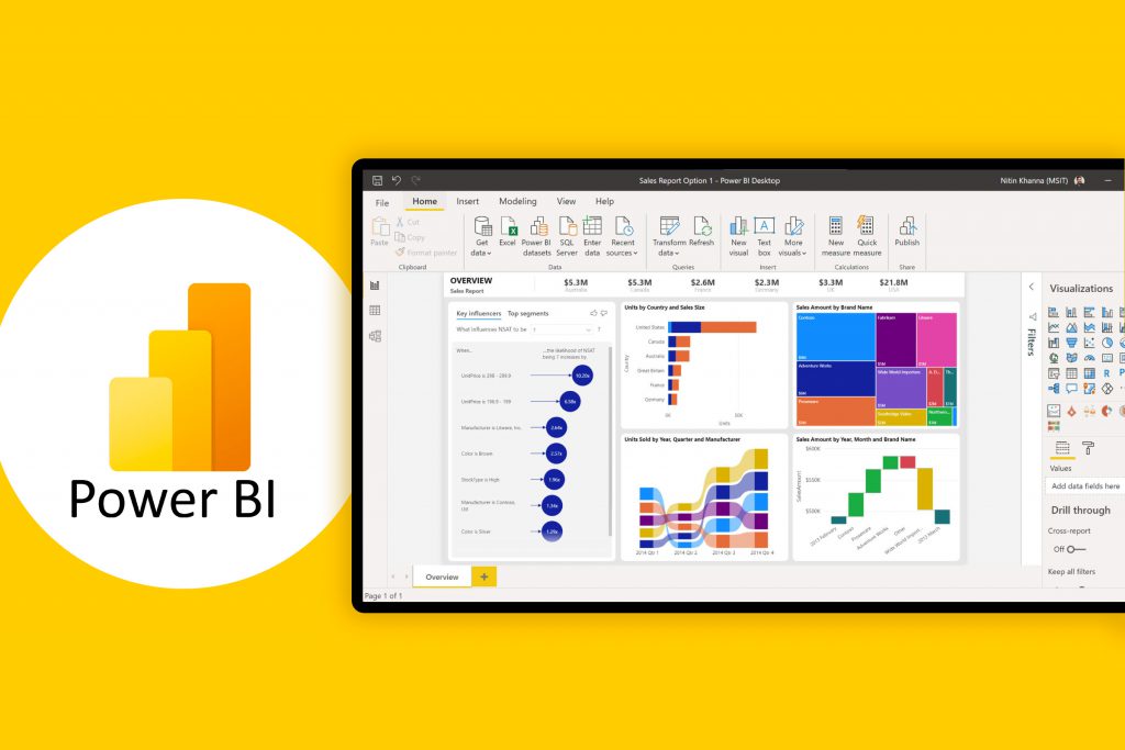
A Power BI dashboard, often called a ‘canvas,’ is a single page that gives highlights of a business situation through visuals such as bar charts, line charts, or graphs that provide an easy method of tracking performance metrics.
A well-presented dashboard connects different datasets as visuals with high-level information that is only important to the reader. Dashboards can be used to analyze sales, website traffic–which product generates the most revenue, and weekly or monthly completed deliveries. They are used by enterprises to gain insights into their overall well-being or into specific departments or processes.
How to Make a Power BI Dashboard
The Power BI dashboard is only available in Power BI Service and cannot be created on Power BI Desktop. If you have access to Power BI Service, you can hire a freelance Power BI developer from a reliable platform like Guru or follow these six simple steps to create a Power BI dashboard.
1. Select the Data Set
The first step to creating a dashboard from the Power BI Service is selecting the data set you want to represent. To do this, click the ‘Get Data’ button and navigate to the ‘Files’ section. Click ‘Get,’ select ‘Local File,’ then choose and Import the file you want to visualize. After importing, your data set will appear under the recent section of the home screen or under the ‘My Workspace’ screen.
2. Select the Data Sources
Power BI lets you connect data from multiple sources including Azure SQL Database, Azure Synapse Analytics, and Spark. To select your data source, open the Home screen and click ‘Get Data.’ Select the ‘Get’ button under the Databases section. Choose the relevant data source from the options provided.
3. Create a Data Model
To create a data model on Power BI, click ‘Create’ on the home screen. You can select ‘Paste,’ manually enter the data, or pick a published dataset. When you have a data set ready, use Power BI Desktop or Excel to connect to, query, load, and import the data into a data model.
4. Establish Relationships Between Data Sets
After importing a data model, Power BI automatically establishes relationships between tables. However, you may need to do this manually when the autodetect feature does not give the required results. To use Autodetect, Navigate to the Modeling tab, select ‘Manage Relationships,’ choose ‘Autodetect,’ and close the dialog box.
To manually establish relationships, click ‘New’ (instead of ‘Autodetect’) and a ‘Create Relationship’ dialog box will open. Select a table in the first table list and the preferred column. In the second table drop-down list, choose the other table you want to establish a relationship with and select the correct column that matches. Select ‘OK’ when all the relationships have been established.
5. Visualize the Data
To customize the visualization of the data sets, open ‘My Workspace’ and click ‘Edit.’ Under ‘Visualizations’, you can find a large number of charts, maps, and tables to choose from. Drag and drop your preferred visuals from the right sidebar to the axis.
6. Design the Dashboard
Because the Power BI dashboard is a single page, you will need to design the canvas to properly tell your story. The colors, text, images, media, and custom metrics need to be well organized for the dashboard to best communicate the story.
To edit the theme, open ‘My Workspace’ and click ‘Edit.’ Click the Dashboard theme and select one of the prebuilt themes. However, you can create a custom-built theme using the Custom option. If you find this too difficult, you may be wondering what a Power BI developer is and if an expert found on Guru might be able to help you better understand what is Power BI used for.
Advantages of a Power BI Dashboard
Power BI dashboards help enterprises organize and visualize important information into an at-a-glance format to help them understand their most valuable data. With Power BI dashboards, enterprises can set specific key performance indicators, so users can quickly evaluate reports and the metrics related to the performance tracking of a business operation or department.
With Power BI dashboards, users can create visualizations from multiple datasets or multiple reports. They help enterprises detect changes within their operations or department, both positive and negative, often in real-time.
Power BI dashboards can be customized to meet the requirements of any enterprise.
Because they are single-paged documents, information on important performance metrics can be easily shared with other departments. Multiple applications can also be integrated into Power BI dashboards to offer uniform user experiences.


