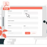
A PDF form is a bridge between you and the answers you need. If you fail to design a PDF form well, there’s a good chance your audience will not understand what you are asking for—or worse—ignore it altogether.
For that very reason, you need to make your PDF form reader-friendly. Below are seven design practices that can help you communicate questions effectively to your target audience. If you hire a PDF form creator to design your form, make sure the final deliverable is based on these design principles.
What Are the Components of a PDF Form?
Before thinking about how to enhance a PDF form design, it’s important to take a close look at the basic components of a PDF form. Generally, a PDF form is comprised of the following components:
- Field labels: This text tells the user what information they have to provide. It can be a question or a simple label, such as a date or address.
- Input fields: Form filler automation might enter information in the fields that include text, checkboxes, sliders, etc. You can guide your audience on how to edit form fields in PDF to ensure they accurately complete your form.
- Validation: The computerized check makes sure that the user provided the correct information (such as an email address).
- Action button: When the user clicks a button, an action is performed. This is usually used for submitting forms.
At times, form creators offer assistance and feedback that help the user understand how to fill the form properly.
Best Practices to Design a Great PDF Form
- Keep It Clean
When designing a PDF form, give it a central prominent title and add one or two lines of supporting text at the top. This content explains the purpose of the form or provides instructions about how to fill it out.
In addition, opt for a harmonious color combination and a font that’s easy to read. We recommend using Arial, Helvetica, or Verdana if you’re creating a business form. There should also be ample white space in your form for better readability.
- Use a One-Column Design
Surveys indicate that one-column designs perform much better than multiple-column designs. When you align all of the questions in one column, it is easier for the user to scan the form and answer questions quickly.
If you use a multi-column design, there’s a greater chance you’ll disrupt the user’s focus when they’re filling out the form, especially if they are on a mobile device and the field sizes are altered; they may even skip a few fields.
- Group-Related Information
If you’re asking for first, middle, and last names, group these questions in a single section and ask them in sequential order. If you disperse these types of questions (such as asking for the first name at the top of a form and the middle name after asking for age), the user may leave the field blank. Disorganization could negatively affect the way they answer the remaining questions.
That said, you can make multiple columns for group-related information. You should only do this if it’s closely related, such as first, middle, and last names. It’s not a good idea to make multiple columns for name, age, and place of birth only because they are pieces of information that fall into the same broad category, such as biodata.
- Left Align Labels
Have you ever wondered why all of the content on the internet is often left aligned? This is because it’s easier for the human eye to pick the beginning of the second line as soon as the first ends when the text is left aligned.
We recommend using this tactic to your benefit when creating PDF forms–align all of your labels to the left and it will reduce the time and effort required to fill the form.
- Auto-Fill Information
When asking for geographical location, student identification numbers, or other data that may already exist in a database (be it linked to you or the form filler), it’s a good idea to integrate application programming interfaces (APIs) in your PDF form. This cuts down unnecessary typing, further automates the form-filling process, saves time, and minimizes user intervention.
Because this is a technical process and very few online PDF editors offer API integrations as part of their platform, we recommend reaching out to professional PDF editors if you want this included in your form.
- Strategically Align Multiple Options
When using checkboxes or radio buttons, you can use text or graphics. If you’re using text, use one to two words per option and align the options vertically as this makes it easier for the reader to scan.
If you’re using graphics, align them in a grid, because images occupy more space on screen and you don’t want it to look like a lengthy list.
- Identify Errors in a Timely Manner
It will frustrate the person filling out the form if they fill out the entire form only to have their submission bounce back with the message, “errors detected.” Instead of identifying errors at the end of the process, place an inline error message that shows up the moment the mistake is made. For example, a pop-up on top of the location of the error makes it easier for the user to understand the problem they have to fix.
Of course, these aspects can be tricky to juggle on your own, which is why it may be best to hire a professional, freelance PDF expert on Guru to help make sure your forms align with best practices as closely as possible.


